
Mobile devices are taking the Web by storm. There are users out there who are ditching their laptop computers to use their Tablets and Smartphones. As far as Desktops are concerned, many people have given them up a long time ago. It almost sounds outdated to talk about logging into a website from a laptop or Desktop, especially with the launch of devices like iWatch. With this device, users can buy a cup of tea and check their bank accounts without whipping out a Smartphone.
Will iWatch devices leave Smartphones in the dust? If so, it’s crucial that business owners stay abreast to what is happening in the industry (daily). Unless you are catering to a crowd, that doesn’t use mobile devices at all, having a responsive website design is no longer optional.
What is Responsive Web Design?
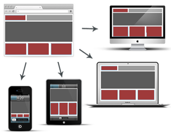 Whether a person is using a mobile device or a Desktop computer, a responsive website design will automatically adjust to a user’s screen. It provides Web users with an optimal viewing experience by simplifying navigation, such as reducing the need to scroll, pan or resize a page. One major advantage of responsive design is that you don’t have to worry about having a separate website for each computing device. Responsive Web Design has come a long way since its conception back in mid-2000s ...that brings us to the historical origins of responsive design.
A Brief History Lesson
Here are few interesting facts about Responsive Design:
- Ethan Marcotte, a web developer from Boston, MA, handcrafted the term Responsive Web Design.
- Responsive Website Design, also referred to as RWD, was first demonstrated in 2004 by Cameron Adams. He presented a website layout that adapted to "browser viewport width."
- 2013 was considered the 'Year of Responsive Web Design', according to Mashable.
- Approximately, 28% of Americans access the Web more often on their Smartphones than their Desktop computers.
- Google suggests that web designers and developers follow the industries "best practice of using responsive web design." They recommend using CSS media queries to decide the rendering on each mobile device and to serve the same HTML for all devices.
The future of responsive design is looking bright. As long as mobile devices are around, responsive websites are here to stay. So, jump in where he water is fine!
Why Is Responsive Web Design Important?
 This design concept has stood the test of time and has proven that it is more than a buzzword or a design trend. The Internet is being flooded with mobile users like never before. In 2016, there will be more than 2 billion Smartphone users globally, according to eMarketer. These statistics provide a good reason to make sure your website is optimized for ALL mobile devices.
In a recent survey by The Social Media Hat, almost half of online consumers revealed they will not return to a site if it fails to load on a device properly. Imagine the adverse impact a non-responsive website will have on conversions. If a site doesn’t immediately captivate user, they will abandon it and go elsewhere. There are many businesses that have lost business to the competition because of, not having a responsive design.
Quick Tip: Remember,your website is also your brand.
More Important Things to Consider
Whether you are having a new website built or an existing website optimized for mobile devices, there are a few important things you should consider, such as following:

Responsive = Increased Conversions
Whether a user is purchasing a product, signing up for a newsletter or downloading a white paper, the process should be effortless. The easier you make it for a user, the higher the conversion. A website that is difficult to view or navigate will have a negative impact on a website’s conversion rating. Do not give users a chance to think twice about taking action on a site.
Make Sure Your Mobile Pages Load Quickly
 We used to follow the 7 second rule to capture the attention of a Web user. Today, that has all changed; there is no time to waste. Word of Advice: Don’t give your visitors a reason to leave your website. If your website doesn’t load within seconds on a user’s mobile device, he/she will leave. Remember the popular phrase, You snooze, you lose? This way of thinking can be compared to slow loading Web pages.
Also, make sure your web developer reviews all of the content that will appear on your page, such as your text, buttons, and images. Not every mobile device requires every resource (ex. JavaScript, image files or CSS files). Keep in mind, the more resources your site contains, the slower it will load, so, keep it simple as possible.
 Call-to-action Buttons Should Be Large Enough for Mobile Screens
Have you ever been on a website with your Smartphone or Tablet and tried pressing a call-to-action button that was so tiny you became frustrated and gave up? This is one mistake we have seen developers make. You can avoid this complication by making your call-to-action buttons larger. Your web developer should be able to design an interface with call-to-action buttons that are the right size.
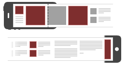
 Consider ‘One’ Image Resolution
A responsive website will automatically change the image resolution based on the mobile device used. Images should not be too large; otherwise, it will slow down the speed of a web page. You can make larger images an ideal size on your consumer's device by using a plugin (for WordPress sites) or by utilizing the HTML5 element 'Picture'. There are other techniques you can use to get the right image resolution as well, ask your developer.
 Get Your Website Tested BEFORE Launching
Early detection is the key to having a well-built responsive website. A good web developer will thoroughly investigate your site before it is presented to the public. During this stage of the game, mistakes can be caught and rectified immediately. Often times, many people are so anxious to get a website up and running that they cut corners by failing to test it properly. Getting your site tested will save you a significant amount of time and money.
Quick Tip: Test your website on Mac OS and Windows. Don't forget to test on all major browsers, such as Safari, Chrome, Firefox, and Explorer.
 Google Highly Recommends Responsive Websites
Google's goal is to serve its Web users. It’s not a surprise that they are huge fans of responsive sites. Why? Because it is much easier for, bots to crawl websites and organize and index content. So, that means if you have a responsive website with great content that’s relevant, engaging and well-optimized, Google will take notice.
Conclusion
At one time, in order to stay ahead of the competition, the company that provided the best product or service won the heart of a consumer. Today, competition goes beyond the type of product or service you are offering. Yes, products and services are important, but people are demanding more. Consumers want better user experiences. Having a well-built responsive website will provide people with what they want. Is your website prepared to fulfill the needs of your mobile users?
For more information on our Responsive Website Design services, feel free to contact Maxmize today for a comprehensive consultation at: 866.213.2352.